Tools for Creating Illustrations in Academic Papers
- Author: Qing-Yuan Jiang
This article provides examples of using Latex and Python to create illustrations for academic research papers.
1. Latex
1.1. The 1st Example
- Basic Settings: width/height, the scope, labels/ticklabels, legend, markers, line types.
\documentclass[crop]{standalone}

\usepackage{graphicx}
\usepackage{tikz}
\usepackage{pgfplots}

\begin{document}
\begin{tikzpicture}
\begin{axis}[
width=0.65\linewidth, height=7cm, % width and height
xmin=0, xmax=10, ymin=0, ymax=10, % the scope of figure
xlabel=Accuracy, ylabel=Epoch, % xlabel and ylabel
xlabel style={font=\small}, ylabel style={font=\normalsize}, % label style
xtick={1,2,3,5,7,10},% xtick and xtick labels
xticklabels={$\alpha$, 1, $\gamma_0$, 3, 2, 0}, xticklabel style={font=\large},
legend style={font=\small, at={(0,1)},anchor=north west},% setting of legend
]
\addplot [mark=*, color=red] coordinates {(0, 1)(8,8)};\addlegendentry{Line1}
\addplot [mark=x, color=yellow] coordinates {(1, 1)(8,8)};\addlegendentry{Line2}
\addplot [mark=+, color=green] coordinates {(2, 1)(8,8)};\addlegendentry{Line3}
\addplot [mark=o, color=cyan] coordinates {(3, 1)(8,8)};\addlegendentry{Line4}
\addplot [mark=square*, color=blue] coordinates {(4, 1)(8,8)};\addlegendentry{Line5}
\addplot [mark=diamond*, color=black] coordinates {(5, 1)(8,8)};\addlegendentry{Line6}
\addplot [mark=pentagon*, color=pink] coordinates {(6, 1)(8,8)};\addlegendentry{Line7}
\addplot [mark=ball, color=purple] coordinates {(7, 1)(8,8)};\addlegendentry{Line8}
\end{axis}
\end{tikzpicture}
\end{document}
- Illustration:
1.2. The 2nd Example
- Two Figures with Shared Legend
\documentclass[crop]{standalone}

\usepackage{graphicx}
\usepackage{tikz}
\usepackage{pgfplots}
\usepackage{pgfplotstable}

\begin{document}

\begin{tikzpicture}
\pgfplotsset{grid style={dashed,gray}}
\begin{axis}[
height={0.475\linewidth}, width={0.575\linewidth},
name=ax1,
xmin=0, xmax=10, ymin=0, ymax=10,
xlabel={(a). $\alpha$.}, xtick={0,1,...,10}, xticklabels={0,1,...,10}, xlabel style = {font=\small},
ylabel style = {font=\small}, xticklabel style = {font=\small}, yticklabel style = {font=\small},
legend style={font=\small, at={(1.385,1.25)},anchor=north east,legend columns=3},
]
\addplot [mark=*, color=red] coordinates {(0, 1)(8,8)};\addlegendentry{Line1;}
\addplot [mark=x, color=yellow] coordinates {(1, 1)(8,8)};\addlegendentry{Line2}
\end{axis}
\begin{axis}[
height={0.475\linewidth}, width={0.575\linewidth},
at={(ax1.south east)}, xshift=0.85cm,
xmin=0, xmax=10, ymin=0, ymax=10,
xlabel={(b). $\beta$.}, xlabel style = {font=\small},
ylabel style = {font=\small},
xtick={0,1,...,10}, xticklabels={0,1,...,10},
xticklabel style = {font=\small}, yticklabel style = {font=\small},
]
\addplot [mark=*, color=red] coordinates {(0, 1)(8,8)};
\addplot [mark=x, color=yellow] coordinates {(1, 1)(8,8)};
\end{axis}
\end{tikzpicture}
\end{document}
- Illustration:
1.3. The 3rd Example
- Histogram Figure
\documentclass[crop]{standalone}

\usepackage{graphicx}
\usepackage{tikz}
\usepackage{pgfplots}
\usepackage{pgfplotstable}

\usetikzlibrary{arrows.meta}
\usepgfplotslibrary{fillbetween}

\begin{document}

\begin{tikzpicture}
\begin{axis}[
height=0.55\linewidth, width=0.75\linewidth,
ybar, enlargelimits=0.25,
legend image code/.code={\draw[#1, draw=none] (0cm,-0.1cm) rectangle (0.6cm,0.1cm);},
legend style={draw=none, at={(0.5,-0.15)}, anchor=north, legend columns=-1,
    /tikz/every odd column/.append style={column sep=0cm}, font=\small
},
ylabel={Metric},
ylabel style={yshift=-5pt},
symbolic x coords={A,B,C},
xtick=data,
bar width=0.5cm,
typeset ticklabels with strut,
xlabel style = {font=\normalsize},
ylabel style = {font=\normalsize},
xticklabel style = {font=\normalsize},
yticklabel style = {font=\normalsize},
ymax=0.75,
nodes near coords, nodes near coords align={vertical},
nodes near coords style={anchor=east,rotate=-90,inner xsep=1pt},
every node near coord/.append style={/pgf/number format/precision=10},
]
\addplot [orange!80!white,fill=orange!80!white]coordinates {(A,0.5448) (B,0.7175) (C,0.7252)};
\addplot [cyan!80!white,fill=cyan!80!white]coordinates {(A,0.5693) (B,0.7273) (C,0.7295)};
\addplot [red!80!white,fill=red!80!white]coordinates {(A,0.5924) (B,0.7261) (C,0.7317)};
\legend{$\alpha$;,$\beta$;,$\sigma$}
\end{axis}
\end{tikzpicture}
\end{document}
- Illustration:
1.4. The 4th Example
- Four Figures
\documentclass{article}
\usepackage[a4paper, bindingoffset=0.2in, left=1in, right=1in, top=1in, bottom=1in]{geometry}
\usepackage{graphicx}
\usepackage{tikz}
\usepackage{pgfplots}

\begin{document}

\begin{figure*}
\begin{minipage}[b]{0.48\linewidth}
\begin{tikzpicture}
\begin{axis}[
width=6cm, height=4cm,
xmin=0, xmax=10, ymin=0, ymax=10,
xlabel=Accuracy, ylabel=Epoch,
xlabel style={font=\small}, ylabel style={font=\normalsize},
xtick={1,2,3,5,7,10},
xticklabels={$\alpha$, 1, $\gamma_0$, 3, 2, 0},
xticklabel style={font=\large},
legend style={font=\small, at={(0,1)},anchor=north west},
]
\addplot [mark=*, color=red] coordinates {(0, 1)(8,8)};\addlegendentry{Line1}
\addplot [mark=x, color=yellow] coordinates {(1, 1)(8,8)};\addlegendentry{Line2}
\addplot [mark=+, color=green] coordinates {(2, 1)(8,8)};\addlegendentry{Line3}
\addplot [mark=o, color=cyan] coordinates {(3, 1)(8,8)};\addlegendentry{Line4}
\end{axis}
\end{tikzpicture}\\
\centering{(a). A.}
\end{minipage}
\begin{minipage}[b]{0.48\linewidth}
\begin{tikzpicture}
\begin{axis}[
width=6cm, height=4cm,
xmin=0, xmax=10, ymin=0, ymax=10,
xlabel=Accuracy, xlabel style={font=\small},
xtick={1,2,3,5,7,10},
xticklabels={$\alpha$, 1, $\gamma_0$, 3, 2, 0},
xticklabel style={font=\large},
legend style={font=\small, at={(0,1)},anchor=north west},
]
\addplot [mark=*, color=red] coordinates {(0, 1)(8,8)};\addlegendentry{Line1}
\addplot [mark=x, color=yellow] coordinates {(1, 1)(8,8)};\addlegendentry{Line2}
\addplot [mark=+, color=green] coordinates {(2, 1)(8,8)};\addlegendentry{Line3}
\addplot [mark=o, color=cyan] coordinates {(3, 1)(8,8)};\addlegendentry{Line4}
\end{axis}
\end{tikzpicture}\\
\centering{(b). B.}
\end{minipage} \\
\begin{minipage}[b]{0.48\linewidth}
\begin{tikzpicture}
\begin{axis}[
width=6cm, height=4cm,
xmin=0, xmax=10, ymin=0, ymax=10,
xlabel=Accuracy, ylabel=Epoch,
xlabel style={font=\small}, ylabel style={font=\normalsize},
xtick={1,2,3,5,7,10},
xticklabels={$\alpha$, 1, $\gamma_0$, 3, 2, 0},
xticklabel style={font=\large},
legend style={font=\small, at={(0,1)},anchor=north west},
]
\addplot [mark=*, color=red] coordinates {(0, 1)(8,8)};\addlegendentry{Line1}
\addplot [mark=x, color=yellow] coordinates {(1, 1)(8,8)};\addlegendentry{Line2}
\addplot [mark=+, color=green] coordinates {(2, 1)(8,8)};\addlegendentry{Line3}
\addplot [mark=o, color=cyan] coordinates {(3, 1)(8,8)};\addlegendentry{Line4}
\end{axis}
\end{tikzpicture}\\
\centering{(c). C.}
\end{minipage}
\begin{minipage}[b]{0.48\linewidth}
\begin{tikzpicture}
\begin{axis}[
width=6cm, height=4cm,
xmin=0, xmax=10, ymin=0, ymax=10,
xlabel=Accuracy, xlabel style={font=\small},
xtick={1,2,3,5,7,10},
xticklabels={$\alpha$, 1, $\gamma_0$, 3, 2, 0},
xticklabel style={font=\large},
legend style={font=\small, at={(0,1)},anchor=north west},
]
\addplot [mark=*, color=red] coordinates {(0, 1)(8,8)};\addlegendentry{Line1}
\addplot [mark=x, color=yellow] coordinates {(1, 1)(8,8)};\addlegendentry{Line2}
\addplot [mark=+, color=green] coordinates {(2, 1)(8,8)};\addlegendentry{Line3}
\addplot [mark=o, color=cyan] coordinates {(3, 1)(8,8)};\addlegendentry{Line4}
\end{axis}
\end{tikzpicture}\\
\centering{(d). D.}
\end{minipage}
\caption{The Fourth Example: Four Figures.}\label{fig:fig4}
\end{figure*}

\end{document}
- Illustration:
1.5. The 5th Example
- Fill Area between Lines
\documentclass[crop]{standalone}

\usepackage{graphicx}
\usepackage{tikz}
\usepackage{pgfplots}

\usepgfplotslibrary{fillbetween}

\begin{document}

\begin{tikzpicture}
\begin{axis}[
width=10cm, height=8cm,
xmin=0, xmax=10, ymin=0, ymax=10,
xlabel=Accuracy, xlabel style={font=\small},
xtick={1,2,3,5,7,10},
xticklabels={$\alpha$, 1, $\gamma_0$, 3, 2, 0},
xticklabel style={font=\large},
legend style={font=\small, at={(0,1)},anchor=north west},
]
\addplot [name path=A1, mark=*, color=red] coordinates {(0, 1)(8,4)};\addlegendentry{Line1}
\addplot [name path=A4, mark=o, color=red] coordinates {(3, 1)(4,4)};\addlegendentry{Line2}
\addplot [thick, color=red, fill=red, fill opacity=0.35] fill between[of=A1 and A4];
\end{axis}
\end{tikzpicture}

\end{document}
- Illustration:
1.6. The 6th Example
- Sub Figure
\documentclass{article}
\usepackage[a4paper, bindingoffset=0.2in, left=1in, right=1in, top=1in, bottom=10in]{geometry}

\usepackage{graphicx}
\usepackage{tikz}
\usepackage{pgfplots}
\usepackage{pgfplotstable}

\usetikzlibrary{arrows.meta}
\usepgfplotslibrary{fillbetween}

\begin{document}

\begin{figure*}
\centering
\newsavebox{\mybox}
\savebox{\mybox}{
\begin{tikzpicture}
\begin{axis}[
xmin=0.75,
xmax=3.25,
ymin=0.645,
ymax=0.73,
ytick={0.65,0.7,0.75},
xtick={1,2,3},
xticklabels={3,4,5},
width=6cm,
height=4cm]
\addplot[mark=triangle*, color=blue, mark options={fill=blue}] coordinates {
(1, 0.6633)
(2, 0.6942)
(3, 0.6958)
};
\addplot[mark=square*, color=cyan, mark options={fill=cyan}] coordinates {
(1, 0.6603)
(2, 0.6904)
(3, 0.6900)
};
\addplot[mark=otimes*, color=red, mark options={fill=red}] coordinates {
(1, 0.6633)
(2, 0.6958)
(3, 0.7228)
};
\end{axis}
\end{tikzpicture}
}
\begin{tikzpicture}
\begin{axis}[
inner sep=0pt,
outer sep=0pt,
axis x line=center,
axis y line=center,
height={0.56\linewidth},
width={0.7\linewidth},
xtick={1,2,...,5},
typeset ticklabels with strut,
enlarge x limits=false,
xticklabels={1,2,3,4,5},
ytick={0, 0.1,...,0.8},
xmin=0.75,
xmax=5.25,
ymin=0,
ymax=0.825,
legend style={at={(0.05,0.66)},anchor=south west},font=\footnotesize]
\filldraw [fill=green, opacity=0.05] (25,0)  rectangle (125,825);
\filldraw [fill=blue,  opacity=0.05] (125,0) rectangle (225,825);
\filldraw [fill=green, opacity=0.05] (225,0) rectangle (325,825);
\filldraw [fill=blue,  opacity=0.05] (325,0) rectangle (425,825);
\draw[<->,thick, black] ( 25,800) -- (125,800) node [pos=0.5,below,font=\small] {1st audio};
\draw[<->,thick, black] (125,800) -- (225,800) node [pos=0.5,below,font=\small] {1st video};
\draw[<->,thick, black] (225,800) -- (325,800) node [pos=0.5,below,font=\small] {2nd audio};
\draw[<->,thick, black] (325,800) -- (425,800) node [pos=0.5,below,font=\small] {2nd video};
\draw[-,dashed, red] (210,730) -- (210,640);
\draw[-,dashed, red] (435,730) -- (435,640);
\draw[-,dashed, red] (210,730) -- (435,730);
\draw[-,dashed, red] (210,640) -- (435,640);
\draw[-Triangle,dashed, red] (210,640) -- (160,400);
\draw[-Triangle,dashed, red] (435,640) -- (375,400);
\addplot+ [mark=triangle*, color=blue, mark options={fill=blue}] table {
1  0.0325
2  0.4983
3  0.6633
4  0.6942
5  0.6958
};\addlegendentry{w/o $v$-GM}
\addplot+ [mark=square*, color=cyan, mark options={fill=cyan}] table {
1  0.0325
2  0.4983
3  0.6603
4  0.6904
5  0.6900
};\addlegendentry{w/o $a$-GM}
\addplot+ [mark=otimes*, color=red, mark options={fill=red}] table {
1  0.0325
2  0.4983
3  0.6633
4  0.6958
5  0.7228
};\addlegendentry{Ours}
\draw (axis cs: 3.25,.225)node{\usebox{\mybox}};
\end{axis}
\end{tikzpicture}
\caption{The 6th Example: Sub-Figure.}
\label{fig:fig6}
\end{figure*}

\end{document}
- Illustration:
1.7. The 7th Example
- Distribution Histogram. The data is read from file.
\documentclass{article}
\usepackage[a4paper, bindingoffset=0.2in, left=1in, right=1in, top=1in, bottom=10in]{geometry}

\usepackage{graphicx}
\usepackage{tikz}
\usepackage{pgfplots}
\usepackage{pgfplotstable}

\usetikzlibrary{arrows.meta}
\usepgfplotslibrary{fillbetween}

\begin{document}

\begin{figure}
\pgfplotsset{table/col sep = comma,table/row sep=\\}
\pgfplotstableread{124,235,46,399,150,124,45\\}\data
\pgfplotstabletranspose{\coldata}{\data}
\pgfplotstablegetrowsof{\coldata}
\pgfmathsetmacro{\N}{\pgfplotsretval}
\begin{tikzpicture}
\begin{axis}[ybar, ymin=0, ytick distance=1]
\addplot +[
    hist={bins=4, data min=0},
] table {\coldata};
\end{axis}
\end{tikzpicture}
\begin{tikzpicture}
\begin{axis}[ybar, ymin=0, ymax=1]
\addplot +[
    hist={bins=4, data min=0},
    y filter/.expression={y/\N},
] table {\coldata};
\end{axis}
\end{tikzpicture}
\caption{The 7th Example: Distribution Histogram.}
\label{fig:fig7}
\end{figure}


\end{document}
- Illustration:
2. Python
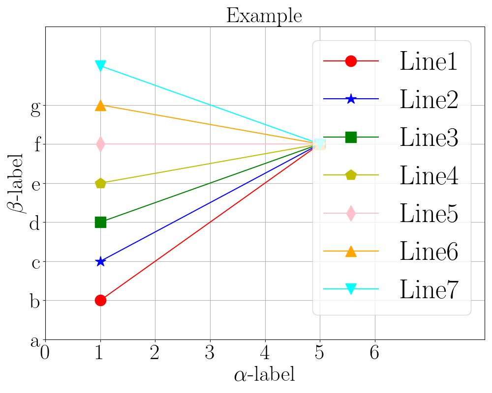
2.1. The 1st Example
- Basic Settings: markers, xlabel, ylabel, xticklabel, yticklabel, and legend.
import os
import matplotlib as mpl
import numpy as np
import matplotlib.pyplot as plt

plt.rcParams["font.family"] = "serif"
plt.rcParams["font.serif"] = ["Times New Roman"]
plt.rcParams['text.usetex'] = True  # used for latex format in xlabel/ylabel/title.

basepath = os.path.abspath(os.path.dirname(__file__))


def plot_fig1(savepath):
    xmin, xmax, ymin, ymax = 0, 8, 0, 8
    fig = plt.figure(figsize=(10, 8))

    x = [1,5]
    y1 = [1,5]
    y2 = [2,5]
    y3 = [3,5]
    y4 = [4,5]
    y5 = [5,5]
    y6 = [6,5]
    y7 = [7,5]

    ax = fig.add_subplot(111)
    plt.plot(x, y1, 'o', color='r', linestyle='-', label='Line1', markersize=16)
    plt.plot(x, y2, '*', color='b', linestyle='-', label='Line2', markersize=16)
    plt.plot(x, y3, 's', color='g', linestyle='-', label='Line3', markersize=16)
    plt.plot(x, y4, 'p', color='y', linestyle='-', label='Line4', markersize=16)
    plt.plot(x, y5, 'd', color='pink', linestyle='-', label='Line5', markersize=16)
    plt.plot(x, y6, '^', color='orange', linestyle='-', label='Line6', markersize=16)
    plt.plot(x, y7, 'v', color='cyan', linestyle='-', label='Line7', markersize=16)
    plt.legend(loc='upper right', prop={'size': 40})

    xlabel = [0,1,2,3,4,5,6]
    ylabel = [0,1,2,3,4,5,6]
    xticks = ['0','1','2','3','4','5','6']
    yticks = ['a','b','c','d','e','f','g']
    ax.set_xticks(xlabel)
    ax.set_xticklabels(xticks, fontsize=32)
    ax.set_yticks(ylabel)
    ax.set_yticklabels(yticks, fontsize=32)
    plt.title('Example', fontsize=32)
    plt.xlabel(r"$\alpha$-label", fontsize=32)
    plt.ylabel(r"$\beta$-label", fontsize=32)
    plt.xlim([xmin, xmax])
    plt.ylim([ymin, ymax])
    plt.grid()
    plt.tight_layout()

    plt.savefig(savepath)


if __name__ == "__main__":
    print(basepath)
    savepath = os.path.join(basepath, 'fig1.png')
    plot_fig1(savepath)
-
Illustration:
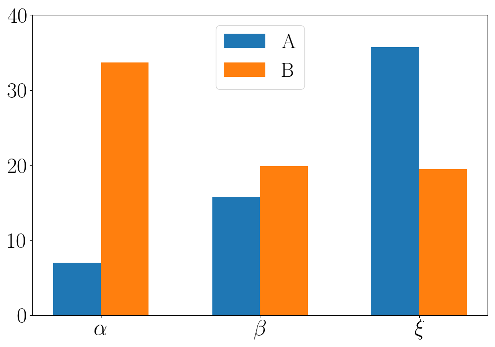
2.2. The 2nd Example
- Histogram Figure.
import os
import matplotlib as mpl
import numpy as np
import matplotlib.pyplot as plt

plt.rcParams["font.family"] = "serif"
plt.rcParams["font.serif"] = ["Times New Roman"]
plt.rcParams['text.usetex'] = True  # used for latex format in xlabel/ylabel/title.

basepath = os.path.abspath(os.path.dirname(__file__))


def plot_magnitude(savepath):
    percent = np.arange(3)
    values_a = np.array([7, 15.8, 35.7])
    values_b = np.array([33.7, 19.9, 19.5])
    bar_width = 0.3
    fig = plt.figure(figsize=(10, 7))
    ax = fig.add_subplot(111)
    plt.bar(percent, values_a, width=bar_width, label='A')
    plt.bar(percent + bar_width, values_b, width=bar_width, label='B')
    plt.xticks(percent + bar_width / 2, [r'$\alpha$', r'$\beta$',r'$\xi$'], fontsize=32)
    plt.legend(loc='best', prop={'size': 30})
    plt.ylim([0, 40])

    values = np.array([0, 10, 20, 30, 40])
    values_labels = ['0', '10', '20', '30', '40']
    ax.set_yticks(values)
    ax.set_yticklabels(values_labels, fontsize=32)
    plt.tight_layout()
    plt.savefig(savepath)

if __name__ == "__main__":
    savepath = os.path.join(basepath, 'fig2.png')
    plot_magnitude(savepath)
-
Illustration: